This article will guide you that how to view the chart and graphs in the KPI dashboard
1. Click on the KPI Dashboard from the quick link.
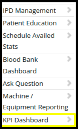
2. In the KPI Dashboard users can check the chart and graph of the following modules
A. OPD Billing
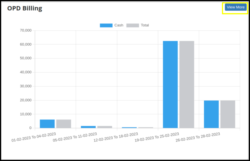
The graph shows the total revenue of OPD Billing based on the date range selected


With the Tabular Representation, users can view data based on specific dates
B. IPD Billing
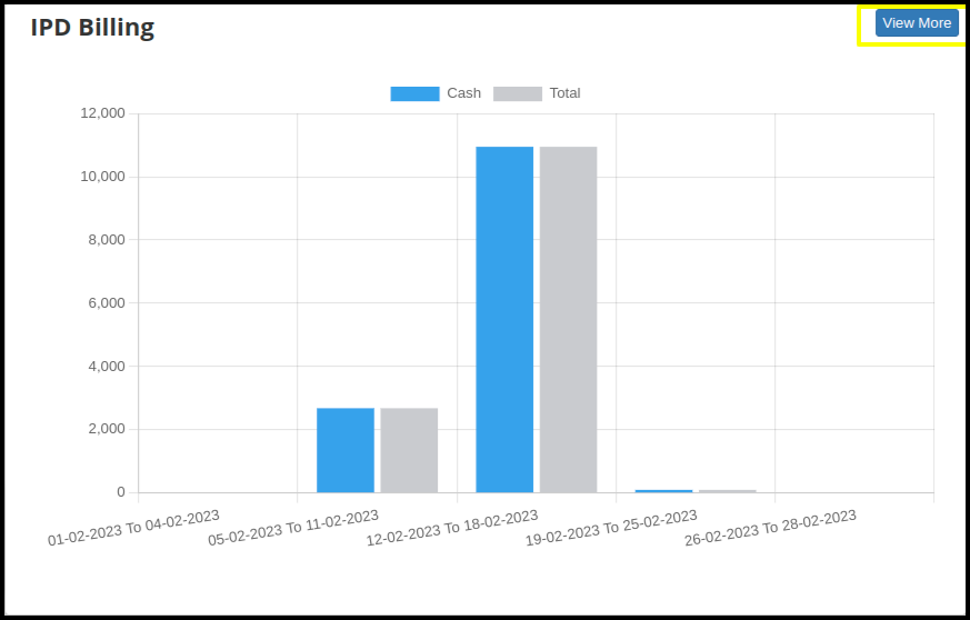
The graph shows the total revenue of IPD Billing based on the date range selected


Here user can check the Graphical Representation.

With the Tabular Representation, users can view the data based on specific dates
C. IPD Admission
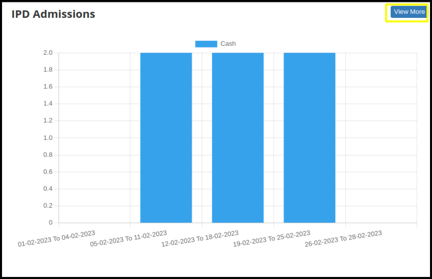
The graph shows the total revenue of IPD Admission based on the date range selected

Here user can check the Graphical Representation.
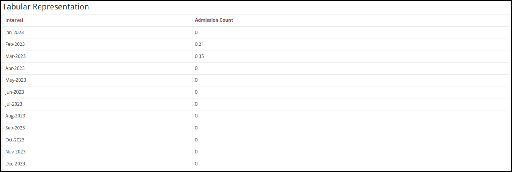
With the Tabular Representation, users can view the data, based on specific dates
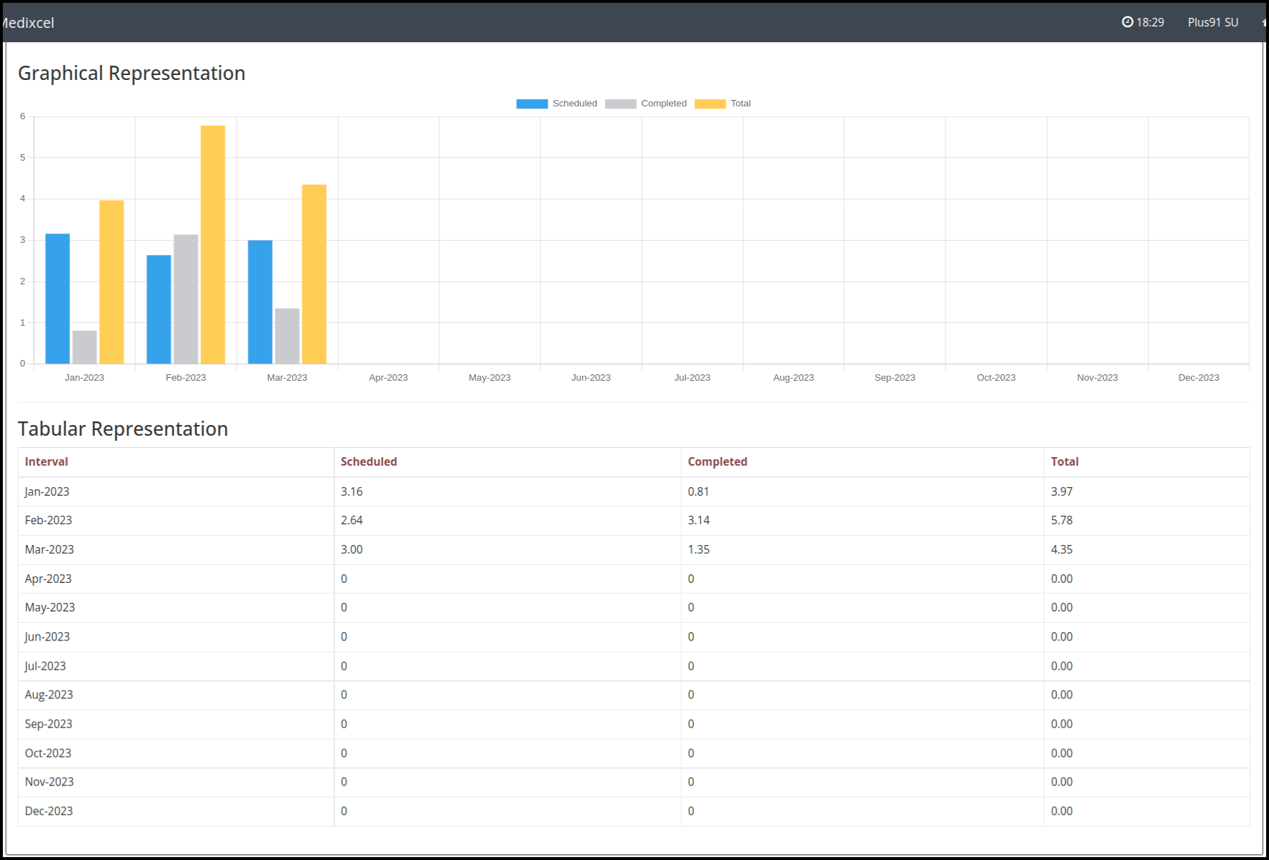
With the Tabular Representation and Graphic Representation, users can view the data, based on specific dates
E. In the KPI Dashboard users can check the graphic and Tabular Representation with the below modules
